Redesign Swiss Admin
Ausgangslage
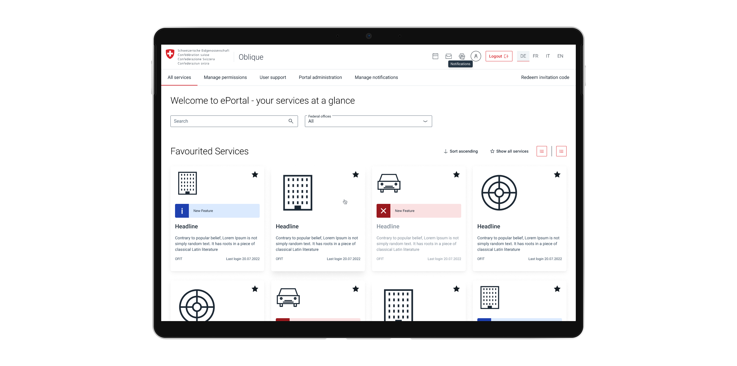
An Agency designed a design system for the Swiss Administration. As a User Experience Design intern, I was able to analyze the designs and make adjustments. Focussing on User Experience and accessibility.
Problem
The agency that created the design system didn't factor in the accessibility of the elements. Hence I found many issues that would have led to problems for the users and since the Swiss Administration is obligated the have an accessibility score of AA at least, we had to change many elements (atoms).
Solution
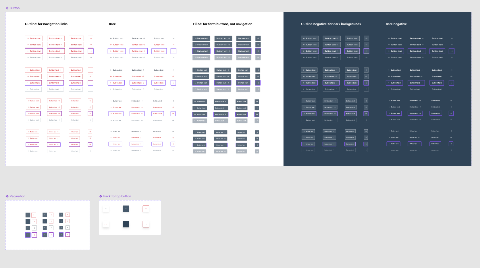
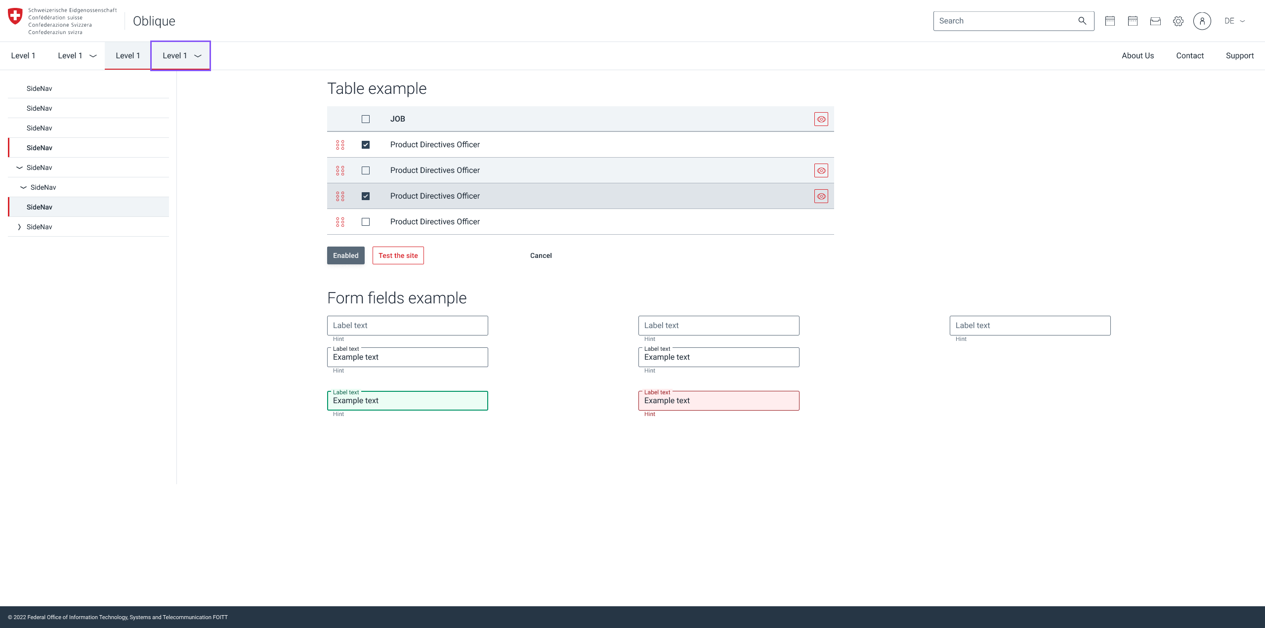
A new design system had to be created. I took the one from the agency as a start and went through every element. Starting with the colors and effects. Then moving on to the elements. Especially the buttons had many flaws: The secondary button was designed with red text and a red border only. Not only is the color red as an interactive color horrible (users tend to think red is cancelling or something went wrong) but when you hovered over the button the red would change slightly but depending on the monitor, nothing could be seen. Thus changes were made, red was replaced by a blue steel color and the hover status got a background-color. This process was made for every Atom in the design system. These changes were initially designed by me and then validated by my mentor. In the end, I created a new looking design system in Figma with components, styles and tokens.


Kontaktier mi
Wenn meh vo mir oder vo mine Projekt wotsch erfahre, chasch mr gärn es Mail schribe.
levin.witjes@gmail.com+41 76 589 32 82