Zivil defense map
Initial situation
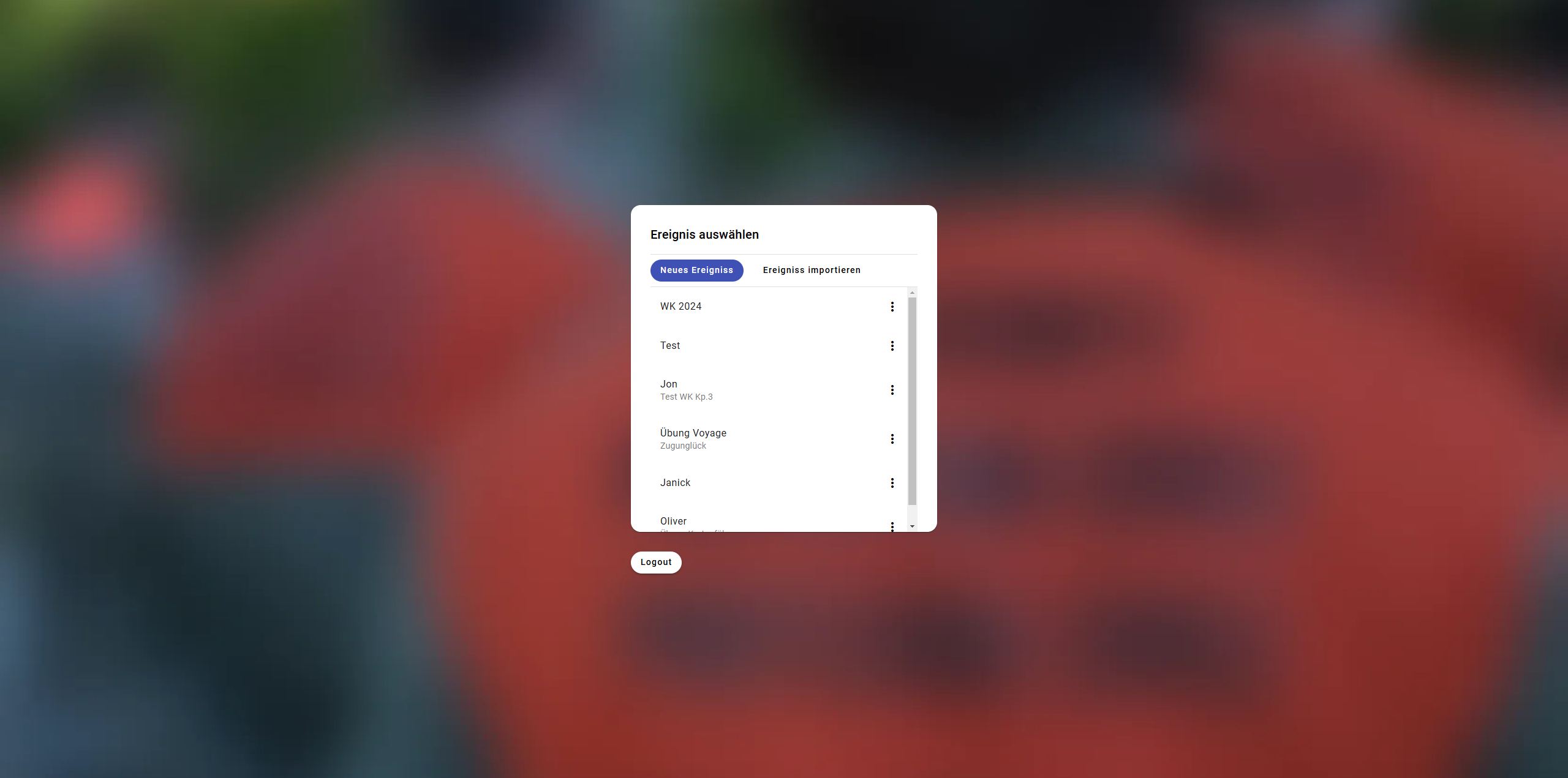
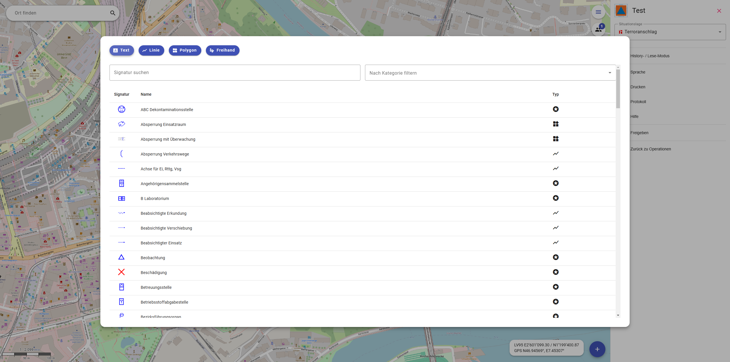
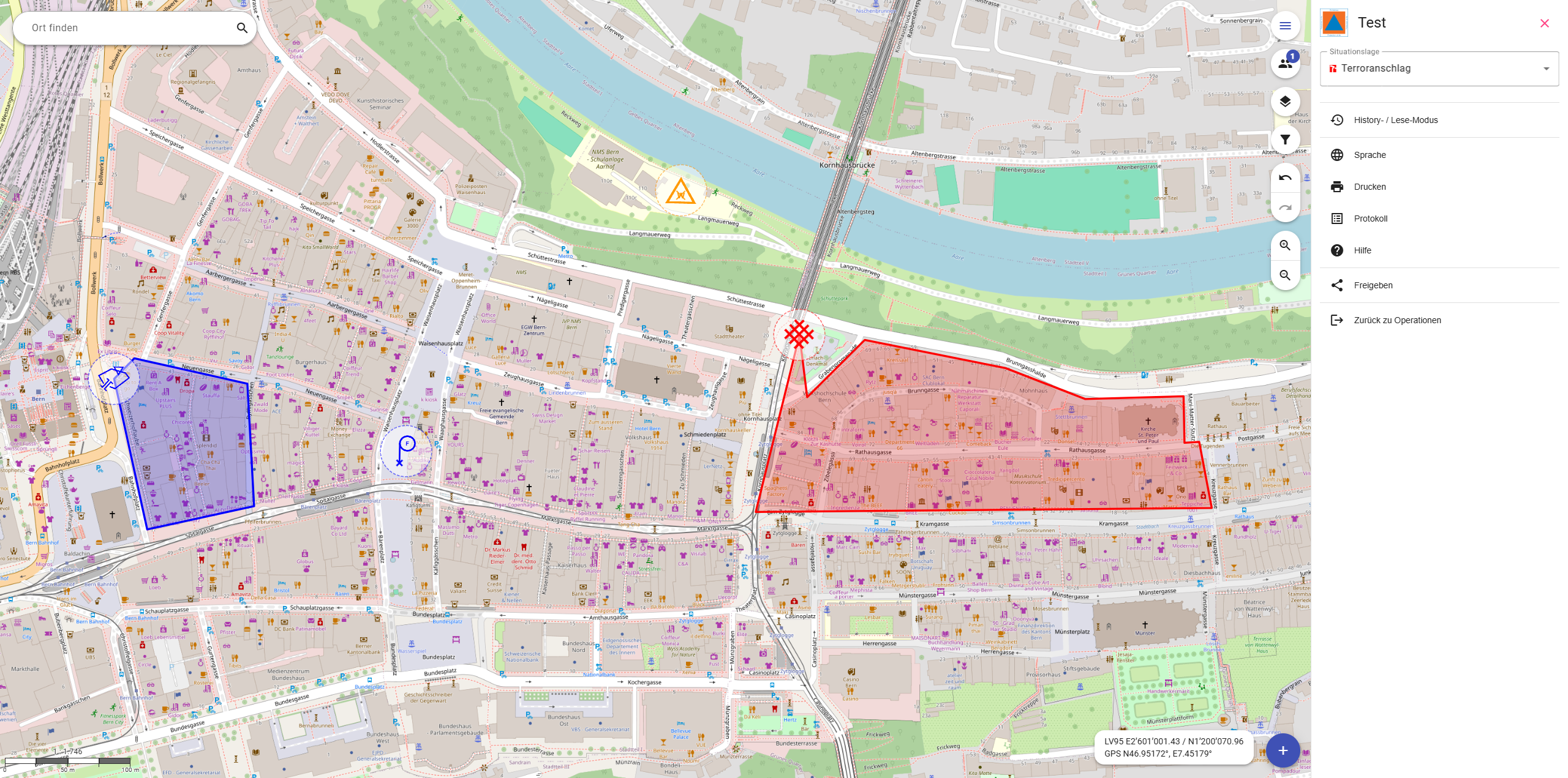
In Switzerland it is mandatory to go to military or to do zivil work. I went to the zivil defense. Our job is to ready for natural catastrophes. We were doing an excerice for a flood scenario and had to fill out a digital map: Which streets weren't passable anymore, where are the firefighters and many other events. So there was lots to draw on this map. So me, as a UX Designer, realised that I couldn't work as fast as I would like because the user experience wasn't optimal and had big room for improvement. I talked to my boss and got to be part of the team which creates this webapp.
Problem
The team consisted of eight developers for about four years. This meant that they had no design mockups and that they had not yet implemented a design workflow. The challenges here were to figure out how we could keep the efficiency of their previous years but with me involved and how we could build on the design itself since there are no mockups.
Solution
The solution is quite unimpressive: We implemented a process that led me to do all the front-end design quality
assurances. This helped me to further deepen my knowledge of front-end programming, as I was also tasked with coding
some minor visual improvements.
We chose this way because designing a whole platform once it's already running would be an inefficient use of my time.
Our next step will be a whole new feature and there I will make a prototype since the user flow is extremely important
there.


Kontaktier mi
Wenn meh vo mir oder vo mine Projekt wotsch erfahre, chasch mr gärn es Mail schribe.
levin.witjes@gmail.com+41 76 589 32 82